The End

Finally here it is, the final presentation day!

2013-02-05 08.09.38

We got up really early, even watched the sun rise – which is a very rare thing to happen. And we are all excited to show off our project. We put a lot of work into it and we think that we have created a neat little game.

For all of you who are not able to attend our presentation and live demonstration – you’re really missing out! But here are some screenshots demonstrating the final state of Drunken Ed. (And our slides can be found here.)

Main Menu:

Displaying Hints:


The Game:

Falling:

Game Over:

9 Screenshots

Because there have been so many visible changes this past week, we’d like to make one more post. Not wanting to make you read any more, here is a demonstration of our progress in 9 screenshots.

Menu:

Game:

Game Over:

Evaluation-guided Changes II

This week we also concentrated once again on following Nielsen’s usability heuristics. These are the most important changes we have made, to better fulfill the following principles.

Visibility of system status: Ed can fall for two reasons, losing balance because he leans too far, or stumbling because he runs too fast. In the first scenario we signalize this with flailing arms, and now we also have an animation to warn the user in the second case: spinning arms.
spinning arms

Error prevention: If the user leaves the trackable area, he is now urged to move back to a better position.
step onto mark

Recognition rather than recall: All possible actions should be visible to the player. We have now implemented a visual hint for the player to perform the bending movement.
hint arrows

Help and documentation: All states, required actions and hints are made clear by a short line of text and additional graphics.
Drunken Ed GameOver6

The Think Aloud Study

The Think Aloud study was performed in the apartment of a team member, on a quiet evening, when both flat mates were at home. These two flat mates, whose identities will not be revealed, volunteered to participate in our study. Their comments and thoughts were recorded in brief notes.

The following sheet was haded out to them, briefly explaining our study, and the tasks they needed to perform: Think Aloud Study.pdf

User Information:

userA User A
Age: 21
Gender: Female
Study: History of Art

User A is rather inexperienced with computer games and has never before interacted with any type of optical tracking system. She was quite clueless about how to move the character, and managed more by coincidence, while walking and hopping around. This however led to her leaving the tracking area a couple of times and the notification to step back into the area left her somewhat confused.
The drinking gesture on the other hand, was understood immediately due to the textual and graphical hints. So selecting the difficulty of the levels was no problem at all – except for the moving about of course. But once she figured out the bending part, this was no longer an obstacle.
The task of NOT taking a picture, when reaching the highscore screen took some thinking, but she patiently waited until the countdown was over. The overall impression was that the game was fun and the highscores gave motivation to try again.
At some point she got overexcited and dared to drink Vodka – the really hard stuff. The result was an almost immediate crash of our poor Ed. This level might be slightly too difficult.

userB User B
Age: 26
Gender: Male
Study: Computer Science

User B has quite a lot of experience with gesture tracking systems himself, and quickly caught on to the controls. He performed the drinking gesture rather sloppily however, which resulted in a somewhat strange animation. Other than that the performance went smoothly. He felt the Easy level was boring, since it was no challenge for him. The Vodka level however seemed too difficult once again. So oddly Wine seems to be his drink of choice all of a sudden. Furthermore he commented on the countdown on the Game Over screen, which he found too long.

Discovered Issues

From the issues mentioned by our candidates, we have singled out the following, ordered by severity and starting with the most urgent. Most of these have already been implemented.

  • Bending Hint: If the player seems incapable of moving the character around, a hint is displayed.
  • Leaving the tracking area: If the player leaves the tracking area, he is now told approximately in which direction he needs to move to get back.
  • Difficulty: The difficulty of the levels will be tweaked and tested repeatedly in the following week.
  • Animations: The drinking animation still requires refinement and will be worked on.
  • Waiting time: Countdowns and waiting times will be reviewed, tested and adjusted, to allow a smooth flow and comfortable gaming experience.

highscores UserA+B

Task Breakdown

This is a list of who did which subtasks each week.

Week 6 – Implementation

  • Alexander Biskupski: Track when player leaves mark, improve drinking gesture detection, track arm and head angles
  • Andreas Fender: Tweak mechanics, fading screen transitions, new fonts, stumbling animation, physics improvement, character texture
  • Tiare Feuchtner: Manage blog, update Menu graphics, hint implementation, perform study
  • Marcel Karsten: Create game and menu graphics, display distance in game
  • Jonas Willaredt: Redesign game over screen, fixed highscore

Week 5 – Heuristic Evaluation

  • Alexander Biskupski: Heuristic evaluation of Drunken Ed, track hand position, ignore multiple users when tracking
  • Andreas Fender: Heuristic evaluation of Drunken Ed, character animation
  • Tiare Feuchtner: Heuristic evaluation of Drunken Ed, manage blog, highscore list
  • Marcel Karsten: Heuristic evaluation of Drunken Ed, endless street, graphics
  • Jonas Willaredt: Heuristic evaluation of Drunken Ed, image capturing, highscore saving

Week 4 – Implementation

  • Alexander Biskupski: Implement body tracking with Kinect
  • Andreas Fender: Set up framework, create player model
  • Tiare Feuchtner: Create main menu, game over screen, blog
  • Marcel Karsten: Implement game play logic
  • Jonas Willaredt: Manage highscores, image segmentation

Week 3 – Paper Prototype / Initial Tests

  • Alexander Biskupski: Ideas for paper prototype, p.p. construction, testing
  • Andreas Fender: Ideas for paper prototype, p.p. concept, material acquisition, p.p. construction, paper character
  • Tiare Feuchtner: Ideas for paper prototype, p.p. concept, p.p. construction, gui elements, testing, blog about Observations
  • Marcel Karsten: Ideas for paper prototype, p.p. construction, highscore screen, testing, blog about the Paper Prototype
  • Jonas Willaredt: Ideas for paper prototype, p.p. construction, highscore screen, testing, blog about the Making Of

Week 2 – Users / Storyboarding

  • Alexander Biskupski: Discuss interview questions, scenario ideas, conduct interview, discuss design principles
  • Andreas Fender: Discuss interview questions, scenario ideas, create storyboard, conduct interview, discuss design principles
  • Tiare Feuchtner: Write interview questions, scenario ideas, organize blog posts, description of interviewees, report interview findings, compose design principles, create poll
  • Marcel Karsten: Discuss interview questions, scenario ideas, conduct interview, discuss design principles
  • Jonas Willaredt: Discuss interview questions, scenario ideas, conduct interview, discuss design principles

Week 1 – Project Initialization

  • Alexander Biskupski: Project description
  • Andreas Fender: Brainstorm short descriptions, sketches, Project description
  • Tiare Feuchtner: Blog management, Brainstorm mind map
  • Marcel Karsten: Brainstorm short descriptions, sketches
  • Jonas Willaredt: Brainstorm short descriptions, persona

Evaluation-guided Changes I

According to the results of our evaluation, we have implemented some features to fulfill some of Nielsen’s design principles. The following points illustrate our changes to comply with the corresponding principle.

Visibility of system status: To inform the user about when he needs to interact, we now display a short countdown when the level starts. Furthermore we will let the figure flail about, when a critical leaning angle is reached – this way the player will sense that he is about to fall and fail the game. Both scenarios can be seen below (the second image also shows the figure’s skeleton for debugging purposes).
Countdown walk_through_city_flailing

Motivation (Additional Principle): To motivate the player to try again an get better at the game, we display the highscore boards above the level selection.

Consistency and standards: To clarify the difficulty of the levels symbolized by the different types of alcohol, we print the words “Easy”, “Medium” and “Hard” above the corresponding highscore boards.

Both of these points can be seen in the following screenshot.
menu_highscores

Heuristic Prototype Evaluation

We have analyzed our game regarding Nielsen’s 10 Usability Heuristics and added two further principles, which we deem essential. Here we have listed them ordered by severity.

  1. Visibility of system status: The system status should be fairly clear in the Menu and Game Over screen, however not so in the actual game. This aspect is absolutely necessary, and we plan to achieve it by displaying some kind of loading bar or countdown when the level starts, so the player knows when he needs to interact. Furthermore we will let the figure flail about, when a critical leaning angle is reached – this way the player will sense that he is about to fall and fail the game.
  2. Motivation (Additional Principle): All difficulty levels are available to play, so an advanced player does not need to stagger through all the easier stages first to reach a sufficiently challenging level. The highscores displayed above the level selection should provide the necessary motive to start another game and improve your score.
  3. Error prevention: An error we expect to ocurr, is the user leaving the trackable area. Therefore the user will be urged to position himself on the x marked on the floor, if he should wander about too much.
  4. Help users recognize, diagnose, and recover from errors: If the player walks away, he will be notified, that tracking has been lost. He will then be able to resume the game, if he returns in time. Otherwise the game will switch back to the Main Menu.
  5. Match between system and the real world: have We use only very few words and phrases, which should be easily understandable. We will try not to use any kinect or tracking specific vocabulary (e.g. “calibration”). The figure is controlled simply by the gestures drinking and leaning, which should be well known concepts to any individual in our target group.
  6. Aesthetic and minimalist design: All textual information will be kept to a minimum. Additional info will be provided through animation or symbols, if needed.
  7. Recognition rather than recall: In all user interfaces, possible gestures will be hinted to the player, by displaying “Peter Pan’s shadow”. With this we mean, that a shadow of the figure will be displayed, which performs the required action and prompts the player to imitate him. If this has no effect, arrows will be displayed indicating the critical action. During the game, the selected difficulty level should be constantly visible to the player. We might visualize this by letting the figure hold the according bottle. Furthermore we will display the distance and time the player has already stumbled along. At end of the game a score will be calculated from this.
  8. Learning curve (Additional Principle): A player can improve his performance and score, if he plays more often.
  9. Help and documentation: Given by the setting, ther will be no documentation or menu with a ‘Help’ option. All necessary help will be given ingame by displaying the shadow, symbols, or even text if necessary.
  10. Consistency and standards: Both in the menu, and in the game, the figure can always be controlled by leaning to the side. This should afford some consistency. The unusual level-selection by performing the drinking gesture will be hinted, to compensate for it’s lack of standard. Furthermore the difficulty levels are unconventionally defined by alcohol types – to comply with a standard we will also subtly denote them with the words “Easy”, “Medium” and “Hard”.
  11. User control and freedom: The only scenario we could think of, is if the player chooses a wrong door. To undo this mistake, the player has various options. He can either behave in such a way, that the figure falls down quickly, ending the level and restarting again with the menu, or he can simply walk out of the tracked area. The system will then display a countdown, during which it will allow him to return and resume the game, or finally switch back to the menu.
  12. Flexibility and efficiency of use: Since it is not an application, where certain tasks should be completed in the shortest time possible, we deem this aspect irrelevant. It is a game, and not a complex one at that, so we cannot think of any shortcuts we could implement. In addition, this game is meant to help the player pass the time in a waiting situation, and make it seem as short as possible. Thus making the playing process as short and efficient as possible, is not our goal.

First Functional Prototype

This week we finally got to work on the real thing: We began implementing our prototype!

Drunken Ed Game1 Drunken Ed Game2

After dividing up the tasks and setting up the framework for our project, we each got to work and Drunken Ed began to stagger.
Ok, we have to admit, at first he only hovered, and then he more or less summersaulted across the screen. By now he is only capable of a lopsided slither – but it gives the right impression. In addition, our swaying world is decorated with rudimentary trees to give you a sense of movement.

Drunken Ed Menu19
Instead of selecting the levels by lifting a foot to climb the stairs (as we had intended in our paper prototype), we are now using a drinking gesture. Thus, when standing in front of the respective door, you lift your hand up to your face, as if taking a long swig from a jug of cold beer.
This change was suggested upon presenting our paper prototype, and we followed the good advice. The drinking gesture is easier to track and the player is less prone to do this unintentionally. We also use this gesture again, to restart the game at the end. This way we hope to satisfy the principle of Consistency (by both Nielsen and Norman). Also the player can be moved by bending your body, both in the game and in the menu.

Below you can find a some more screenshots from our development process.


Drunken Ed GameOver1

Observations and Feedback

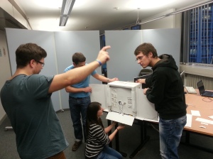
We invested many hours to come up with a concept for a paper prototype which would satisfactorily demonstrate our intended user interface, and spent even more time creating it. After having constructed our nice little model, which worked surprisingly well, we put it to the test with two individuals from our target group.

Already during our construction phase, we received many curious glances, and got great interest from other students. The overall reaction to our prototype was fascination and amusement. There was some disappointment when we told our subjects that this was only the prototype for our user interface and not for our game, but they were still eager to participate.

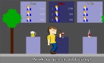
Testing our users required quite some team work. While one controlled the little paper character with the help of chinese chop sticks, two others were busy pulling the puppet’s strings and scrolling the background to create a sense of movement across the scene. A fourth person was in charge of observing the candidate’s reactions and taking notes.

Testing user 1

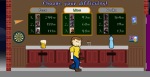
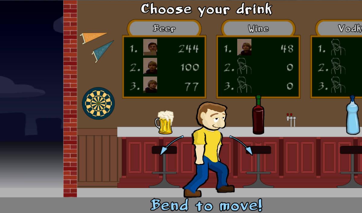
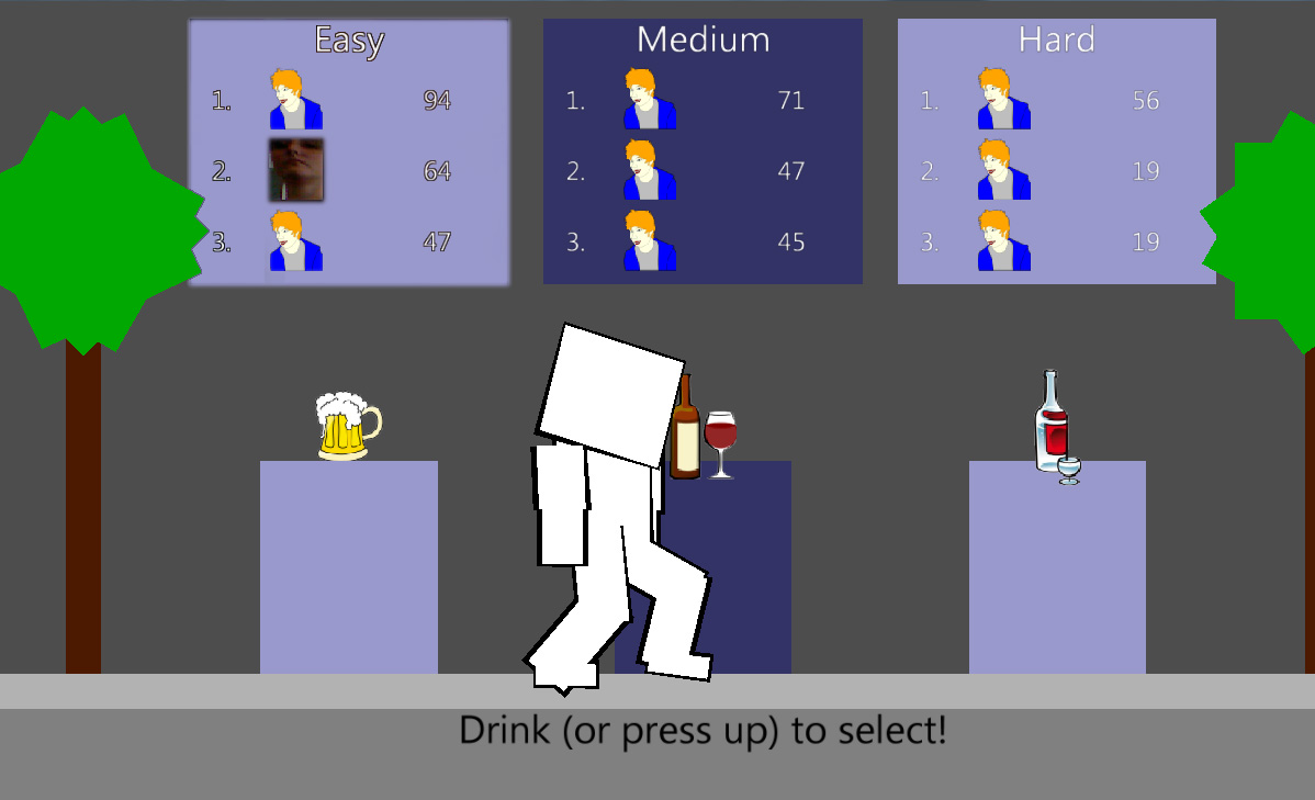
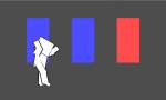
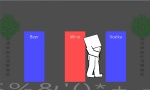
The users had no trouble at all using the first version of our user interface: the one with the buttons. Upon learning, that the character reacted to their body movement, they quickly pointed to the buttons with their arm to select a difficulty. They clearly preferred the buttons reading “Beer”, “Wine” and “Vodka” instead of simply “Easy”, “Medium” and “Hard”, since it just fits the game setting. They also quickly related to the correspondence of Beer being the weakest alcohol – thus an easy level, and Vodka being the strongest – thus the hardest difficulty. However, not everybody might make this connection right away, so it was suggested that we underline their meaning by perhaps displaying a numeric value such as the alcohol level.

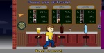
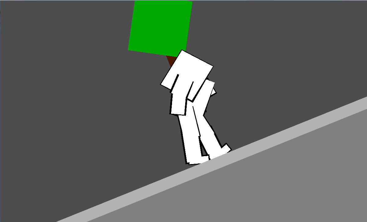
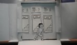
Upon presenting our second user interface, both users immediately voted for this less conventional level selection by choosing a door. After figuring out that they could make the character stagger left and right by leaning in the respective direction, they soon targeted the door with the highest difficulty. Entering the door was a bit of a challenge and their first reaction was to reach out with their hands. For this purpose we had a little arrow ready, which we used to point to the character’s leg. This soon had the desired effect, that the players lifted their right foot, as if mounting the stairs – tadaa the level was successfully selected and the game starts.
Once again the alcohol labels were the preferred indicators for the level’s difficulty, and here a player made the suggestion to additionally symbolize higher difficulty by increasingly twisting and distorting the stairs.

A new idea was to have the character carry a beer-bong, which can be filled with a certain alcohol at one of three alcohol dispensers (once again containing beer, wine and vodka), which can be operated by standing underneath them and raising an arm. Once the character has taken a great gulp, he can stumble off into the respective level. This thought was taken even further, letting the player combine the alcohol by sipping a little of each drink until his stomach is full. The level then starts with a difficulty which is calculated dynamically from the relative amount of each beverage.

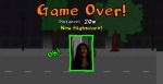
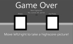
Finally we presented our end screen, which only requires very minimal user interaction. If the player has reached a high score, we will simply take a snapshot of the user’s head. We will display a short countdown and a picture frame around his head to give the brave drunkard a chance to smile. This way we can avoid tedious text input for entering names into highscore lists. A difficulty in presenting this, was the fact, that the high score lists on our menu displayed names. Having pictures there right from the start would have made our intention with the photograph much clearer. Perhaps we should further clarify this, by informing the player with a line of text.

Most importantly, we observed that this type of menu is fun and engaging. A contestant’s encouraging comment was: “This is very cool, I would definitely play it!”
(..and then he even asked for our blog’s address!)

Paper Prototype

Photos of the paper prototype prior to user testing:

Menu I

Menu II

End Screen

Photos of the paper prototype after user testing:

List of changes:

  • After falling (“New Highscore”-view), Ed should be shown in an uncomfortable posture, as for instance lying on the ground in his own puke
  • “New Highscore”-view isn’t a menu anymore, the start screen will be displayed automatically after taking a photo
  • Adding an arrow pointing on the knee, to encourage the user to move his leg and mount the stairs, which starts the level

Additional Ideas:

  • Selecting drinks instead of doors
  • Visualize the stairs more twisted and distorted with increasing difficulty