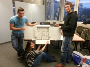
We invested many hours to come up with a concept for a paper prototype which would satisfactorily demonstrate our intended user interface, and spent even more time creating it. After having constructed our nice little model, which worked surprisingly well, we put it to the test with two individuals from our target group.
Already during our construction phase, we received many curious glances, and got great interest from other students. The overall reaction to our prototype was fascination and amusement. There was some disappointment when we told our subjects that this was only the prototype for our user interface and not for our game, but they were still eager to participate.
Testing our users required quite some team work. While one controlled the little paper character with the help of chinese chop sticks, two others were busy pulling the puppet’s strings and scrolling the background to create a sense of movement across the scene. A fourth person was in charge of observing the candidate’s reactions and taking notes.
The users had no trouble at all using the first version of our user interface: the one with the buttons. Upon learning, that the character reacted to their body movement, they quickly pointed to the buttons with their arm to select a difficulty. They clearly preferred the buttons reading “Beer”, “Wine” and “Vodka” instead of simply “Easy”, “Medium” and “Hard”, since it just fits the game setting. They also quickly related to the correspondence of Beer being the weakest alcohol – thus an easy level, and Vodka being the strongest – thus the hardest difficulty. However, not everybody might make this connection right away, so it was suggested that we underline their meaning by perhaps displaying a numeric value such as the alcohol level.
Upon presenting our second user interface, both users immediately voted for this less conventional level selection by choosing a door. After figuring out that they could make the character stagger left and right by leaning in the respective direction, they soon targeted the door with the highest difficulty. Entering the door was a bit of a challenge and their first reaction was to reach out with their hands. For this purpose we had a little arrow ready, which we used to point to the character’s leg. This soon had the desired effect, that the players lifted their right foot, as if mounting the stairs – tadaa the level was successfully selected and the game starts.
Once again the alcohol labels were the preferred indicators for the level’s difficulty, and here a player made the suggestion to additionally symbolize higher difficulty by increasingly twisting and distorting the stairs.
A new idea was to have the character carry a beer-bong, which can be filled with a certain alcohol at one of three alcohol dispensers (once again containing beer, wine and vodka), which can be operated by standing underneath them and raising an arm. Once the character has taken a great gulp, he can stumble off into the respective level. This thought was taken even further, letting the player combine the alcohol by sipping a little of each drink until his stomach is full. The level then starts with a difficulty which is calculated dynamically from the relative amount of each beverage.
Finally we presented our end screen, which only requires very minimal user interaction. If the player has reached a high score, we will simply take a snapshot of the user’s head. We will display a short countdown and a picture frame around his head to give the brave drunkard a chance to smile. This way we can avoid tedious text input for entering names into highscore lists. A difficulty in presenting this, was the fact, that the high score lists on our menu displayed names. Having pictures there right from the start would have made our intention with the photograph much clearer. Perhaps we should further clarify this, by informing the player with a line of text.
Most importantly, we observed that this type of menu is fun and engaging. A contestant’s encouraging comment was: “This is very cool, I would definitely play it!”
(..and then he even asked for our blog’s address!)


